Thigmotaxis on the infinite canvas
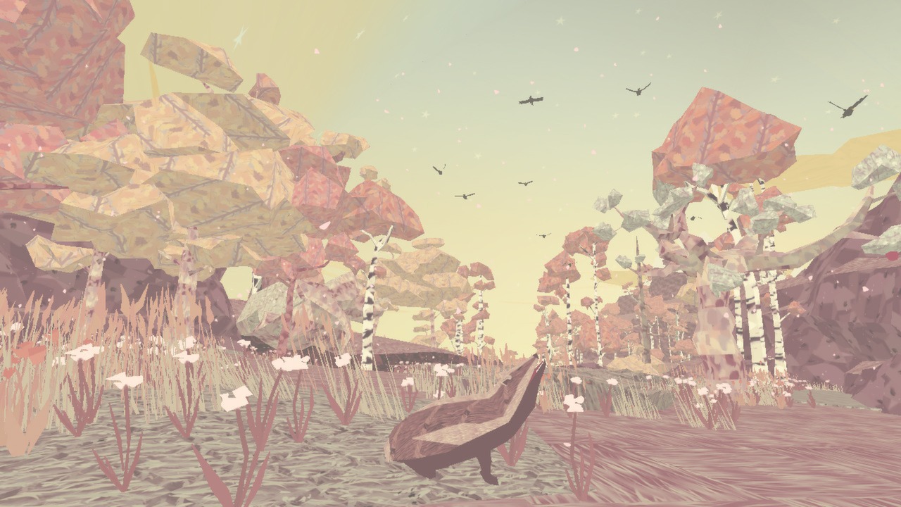
A mother badger sheltering her cubs from harm in "Shelter"
Did you know there’s a word for the way animals, from mice to deer, avoid open space, choosing instead to hug the edges for safety?
We’ll come back to this.
Yesterday I attended Config 2020, the first conference ever by Figma. They make a tool for UX designers which has quickly become a favorite for two reasons. One, it thoughtfully implements all the basics of the craft, making it a joy to use. Two, and more importantly, it has brought design into the world of live multiplayer collaboration in the browser. Figma is to Sketch (another dominant design tool), what Google Docs is to Microsoft Word.
The event was inspiring, wrapped in Tori Hinn and team’s marvelous branding, infused with Figma’s raucous spirit of principled playfulness, and featuring dozens of talks and workshops by members of the community. I had a blast. You can watch the keynotes here.
There was something else simmering below—or perhaps that we were simmering in—that I couldn’t help but notice. Something that’s a defining principle behind why I make games, and what I started writing this blog to explore. It’s this one weird trick; one beautiful attribute: kindness.
Figma’s community is kind. And when I see a kind community, my ears prick up and I start analyzing.
WARNING: BROAD BRUSH GENERALIZATIONS ENSUE
When non-designers think of Designers, they often think of uncompromising assholes—Steve Jobs their patron saint—the archetype of the extravagantly turtle necked white dude with thick-rimmed glasses; usually found berating a poor junior designer or client, perpetuating a hazing culture where credibility demands you talk a big game about your perfectly motivated design and how every solitary sub-pixel has been placed with no less precision than the clockwork complications of a master-crafted Swiss watch.
It’s the notoriously unhinged Pepsi rebrand by Peter Arnell—once called the Bernie Madoff of branding for the striking trail of destruction he left in his wake.
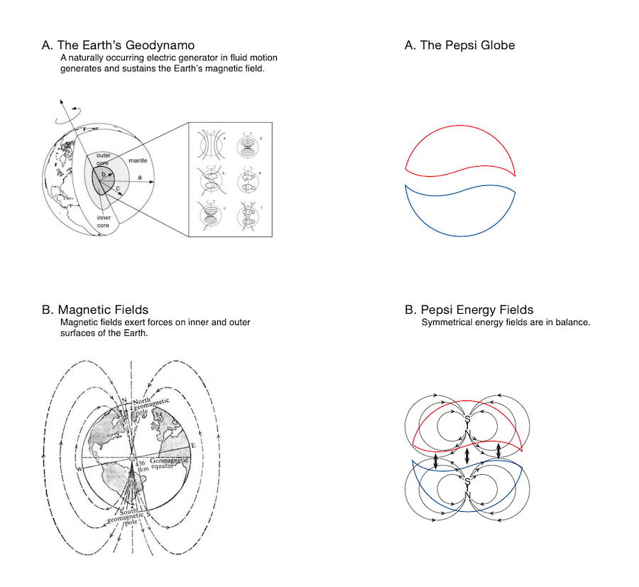
And of course, this “design visionary” and his signature box:

Now, my observation is that there seemed to be a noticeable lack of these folks in the Figma community, both online (Twitter) and in person at Config. A remarkable thing.
Why?
Figma is a space, not just a tool
In a traditional design tool your work is locked away in a file that you—and only you—can occupy at any given time. In Figma, your workspace is now findable, linkable, explorable. Others can visit and see your cursor move around the page, an implicit invitation to help push those pixels with you. (Many cursors, light work as they say).
In the old model you were not visible, only the output of your activity. Others had to reconstruct your intent, your personality, your dynamism, from the fossilized remains of your output; the moment where you were caught in the act of saving by the pyroclastic flow of a deadline or meeting. In a multiplayer file, they can be right there with you.
This is a brand new social contract.

Who might be attracted to this new social contract?
My completely un-evidenced theory is that those who were drawn in first, and who seeded the community, share certain traits. Probably (and I’m generalizing), these designers care less about ownership of their specific pixels, and are more interested in creating together to the point where you can’t identify who did what. These designers want to invite others into their digital homes without feeling the need to clean everything up. They design with their successors and teammates in mind (the design equivalent of leaving really good comments in your code). These designers might be less likely to see their design work as something to be done in mountaintop hermitage, with a “perfect” output curated and presented—probably in a deck of some sort—when they are ready to come down from their isolation.
These are folks who want others in on their mess, without taking it too seriously. Who attempt to anticipate their needs and create a welcoming space.
And of course, this is a social product so environment matters! These folks probably have the benefit of the positive feedback loop of an environment that supports these traits, and gives them like minded collaborators to enjoy them with.
These early adopters are perhaps more willing—and able—to be vulnerable.
At this point, I’m guess every single one of you has come across Brené Brown and her game changing work on the power of vulnerability. If you haven’t, check out her TED talks.
Vulnerability is the birthplace of innovation, creativity and change. To create is to make something that has never existed before. There’s nothing more vulnerable than that. Adaptability to change is all about vulnerability.
Vulnerability and its close cousin, shame, are some of the most powerful emotions and working with them is absolutely necessary if we want to activate the human superorganism. The more we can safely let each other in, the less energy we have to waste on bullshit barriers and toxic strategies for survival.
When a tool becomes a space
This isn’t new. Google Docs did this for the typical office suite way back in 2006 with its Writely acquisition, soon followed by Sheets and Slides. But 14 years later the dominant form of document collaboration remains files attached to emails, so you still get to see that first moment in people when they realize that someone can see what they are writing, live. This remains terrifying for many. It’s no longer just a document editor; it’s a desk with two chairs, or worse an auditorium and you’re suddenly in America’s Jungian nightmare, that of publicly speaking without prep.
Some multiplayer tools work hard to counteract this fear by creating spaces with very explicit contracts. The loudest example is 37 Signals’ Basecamp, which not only implicitly embeds the team’s working style into the deepest bones of the tool but also explicitly attempts to teach that working style with countless blog posts and entire books (REWORK, Shape Up). Just take a look at this playful environment to look at project progress. They might not seem as such, but these hill charts are spaces, just highly restricted—I like to think in a David-Lynch-black-lodge-but-benevolent kind of way.
And if Figma and Google Docs are a real time multiplayer game, Github is turn based strategy. Compare it to Basecamp, and you can see how old school engineering culture trickles into it, for example in the command which reveals who made changes to a specific line of code. It could have been called many things—”author”, “writer”, “editor”, “credit”, “celebration”, “🎉”, (“who wrote that amazing line? “)
It was called “Blame.”
$ git blame README.md
82496ea3 (kevzettler 2018-02-28 13:37:02 -0800 1) # Git Blame example
82496ea3 (kevzettler 2018-02-28 13:37:02 -0800 2)
89feb84d (Albert So 2018-03-01 00:54:03 +0000 3) This repository is an example of a project with multiple contributors making commits.
82496ea3 (kevzettler 2018-02-28 13:37:02 -0800 4)
82496ea3 (kevzettler 2018-02-28 13:37:02 -0800 5) The repo use used elsewhere to demonstrate git blame
82496ea3 (kevzettler 2018-02-28 13:37:02 -0800 6)
It is perhaps no coincidence that this feature shares a name with Tsutomu Niheis’ epic manga about a world overrun by machines, in which the few surviving humans attempt to scrape a pitiful existence by trying remain unnoticed in the corner of impossibly large and fractal mechanical “cities”.

I always imagine the poor engineer outed by this feature, a mistake caught, pinned down suddenly like specimen in failure, ready to be eradicated like those few remaining inhabitants of the city are when spotted by the machines.
But then I have to remember the root of this in the specific humor of a certain type of engineering culture. Anyone remember the Bastard Operator From Hell? Perhaps I’m a wuss but I always struggled with this kind of ironic brutality. (No wonder tech still struggles to break out of its monoculture! Oof.)
Would engineering culture be different if things like these had different names?
Verbs matter—what they are called, and what they do. “Blame” is a tad harsh, and is used more often to get the bottom of errors than to celebrate. Ironically, it actually enhances collaboration by making it easier to know who to collaborate with. The name and the function are in creative tension with each other.
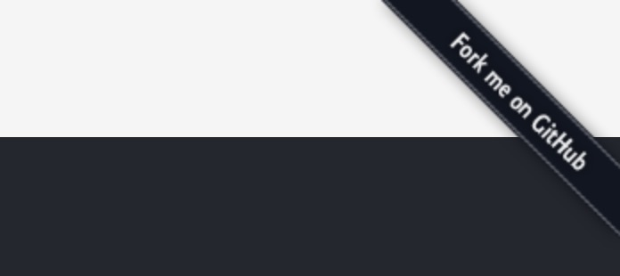
Counterpoint, the playful “Fork this” that once graced the top right of every website that wanted to support Open Source. You don’t have to be Eleanor in the Good Place to chuckle at this one—in this case, the verb’s name and function have the same concept, or I should say, conception, in mind.
“Blame”. “Fork”. “Comment”. All these are new actions make up the architecture of the wide open spaces that happen when singleplayer becomes multiplayer.
What all these multiplayer spaces have in common is that they initially create a feeling of exposure.
A primal fear
One of our most primal fears is of being in open space where a flying predator might swoop down and plant its talons into your back, lifting you bodily away from safety— carrying you while you bleed out, only to tear you apart at its nest, or perhaps drop you from high up to let gravity finish the job. We’re no longer the tiny mammals who developed this fear, but it’s still there, deep inside us.
At its best, Figma’s open space is the feeling of a welcoming plaza, a court to play layer tennis, or perhaps a cozy studio. At worst it’s a broad and exposed plaza where you might run into a predator at any time.
Yet it’s the same infinite canvas. How you end up feeling about it depends not just on the user interface, but how it intersect the social space you’re in. After all, the predator is no longer a great eagle with 4 inch long talons, but rather a hovering, swooping-and-pooping boss or buzzing coworker. Even if it’s just people you already know and love, the sudden change in social contract creates uncertainty, which can be just as scary.
UI and features define how you might encounter your predator—for example, is the file shared or not? Can you clearly see who is there with you? Can you tell what they are looking at? Can you easily ask them? Is there a trace of their passage that tells you whether they were just here? Do you know how long you have until someone jumps in?
Put together, does this user experience create a panopticon?

A wide and impersonal open space?
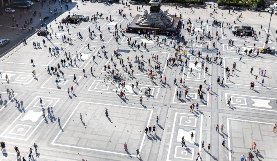
These are ancient fears, which to this day leads to animals—mice, deer, humans!—avoiding open spaces, choosing instead to move by sticking close to the edges. This even has a name: “thigmotaxis”, which I discovered in this striking study that used GPS mapping to show how people with different levels of agoraphobia and anxiety enjoyed a 15 minute walk in a soccer field. (HC= healthy control, HA = high anxiety, LA = low anxiety). Notice how clearly the behavior shows up here.
There it is: thigmotaxis, visualized!
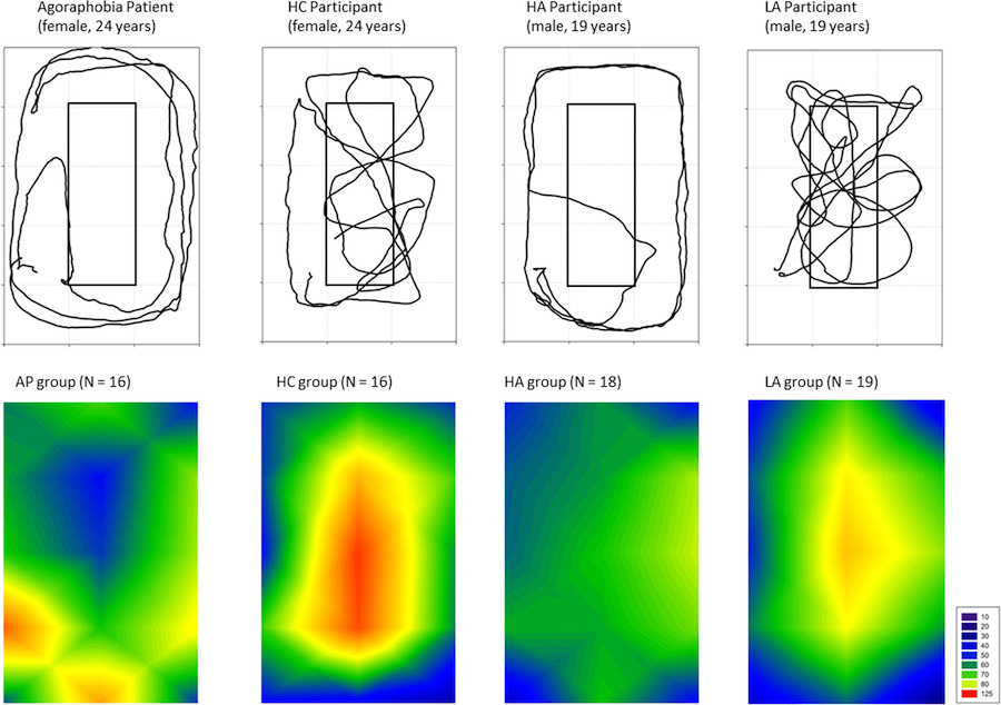
(Side point, I like this tidbit “Active soccer players were excluded because of familiarity with the open field area.” That tells you a lot about how this process works.)
How do you address this?
As is often the case, this all takes me back to Christopher Alexander’s pattern language.
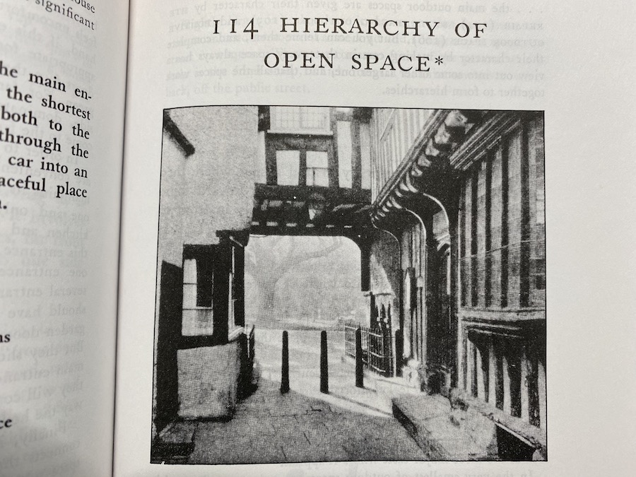
“Outdoors, people always try to find a spot where they can have their backs protected, looking out towards some larger opening, beyond the space immediately in front of them”
Is a Figma infinite canvas “outdoors” or “indoors”? How large should it be to feel “safe”? What does it mean to have your “back protected”, to be able to “look out”?
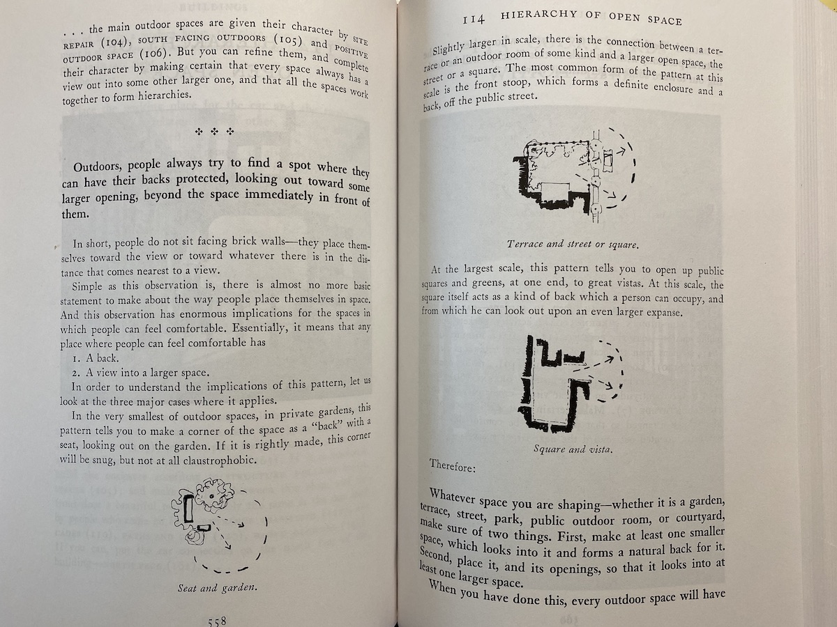
Spaces, whether they are digital or physical, are psychosocial pachinko machines that cause different statistical probabilities of running into certain interactions with other beings. With thousands of years of practice, we’ve identified physical architectures that lead to more pleasing interactions (just look at the diagrams above). But we are so new to the digital!
How do you pleasingly constrain interactions with other people in digital space?
Figma as home
The key is to take into account the different layers of the ecosystem, and by thoughtful design, Figma happens to have structured its strategy exactly in line with one of the most widely accepted behavior change frameworks out there; a true workhorses of serious behavior change interventionists such as public health agencies.
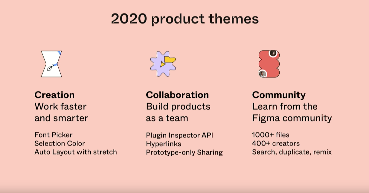
Just look. This is the strategy Figma’s CEO, Dylan Field, presented in his keynote.
And this is the ecological model of behavior change. It starts with the individual and expands concentrically outward, recognizing that change happens if every societal layer is supported by the layer around it. It’s something every single person attempting to change behavior should be aware of, and an essential antidote to the nonsense of our individualistic model of self-improvement (that—is a whole other essay).
Here it’s itemizing “factors affecting adaptation to extreme heat in rural communities.”
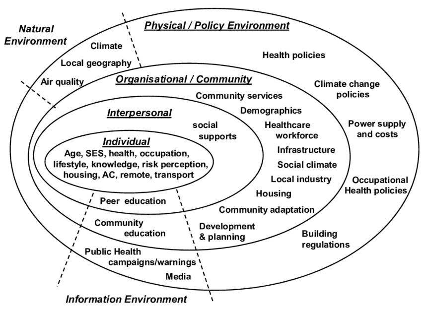
Look familiar?
Single player design tools like Sketch occupy just the center of that model. They exist within the context of a culture about how those files should be shared and worked on together, but don’t actively define that behavior (although they are trying to expand).
Figma, being natively multiplayer, is actively operating at multiple levels, with patterns both in the live multiplayer space where you are actively creating and also in the layers around it.
I can see the pattern language beginning to form. “Playful avatars”, for example. Something about watching those brightly colored cursors fly around the page, each representing powerful creative tools, sets a tone. (Quite the opposite of “blame”)
What about a pattern of “easy to roll back”. Sure, you could grief your coworkers and nuke their stuff, but they can just get it back with the built in version control, making the only permanent change your own level of assholeness. Not a great tradeoff. Nothing to feed the troll.
Step outside the file, and you have the sharing UI itself, the ability to group by Team (a pattern pioneered by Slack), and the big idea of turning design into an open activity with community repos. Could open source design rise out of this just as Github supercharged open source software? I’ll be watching carefully what kinds of verbs are encouraged. Is there a pattern of “community repos”?
What these patterns add up to is a new way of approaching design. A timeless way of designing?
Who knows, perhaps a new generation of designers will grow up sharing their work in the open community of Figma, instead of tiny 400x400px snippets on Dribbble (an online community for designers where people post images of their sexiest design work). On Dribbble, the function and mess is stripped out in favor of the perfectly manicured—a picture of single, handcrafted button; the corner of an artfully composed dialog box; a speculative UI turned 45 degrees, attractively hidden behind a rendered reflection. This is a beautiful and inspiring art gallery, but the opposite of Figma’s ideal of “View Source”.
If Dribbble is Instagram encouraging its posters’ eating disorders by putting out impossible images of perfection, perhaps the Figma community could be more like TikTok’s raw and messy conga lines of video remixing.
The fact that Figma’s strategy can be overlaid over the ecological model of change is fascinating and hopeful. By expanding out from the tool itself to broader circles, they have a chance at changing design culture itself.
A pattern language for digital space?
Going even further, I’m tremendously curious about the digital patterns that will emerge. Christopher Alexander had thousands of years’ worth of examples of human spaces to look at, and a philosopher’s wisdom in interpreting what he saw not just through an architectural lens but through the lens of how it felt to be a flesh and blood human in that architecture.
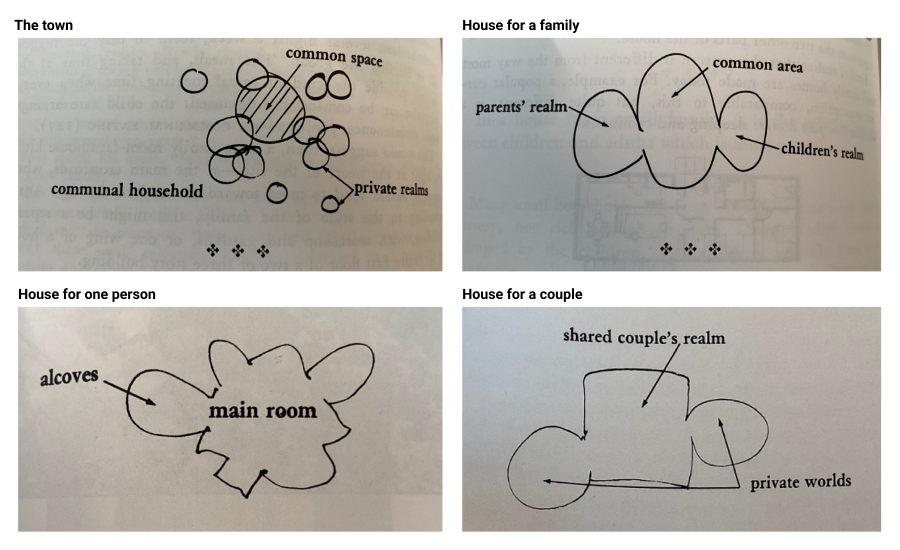
Just look at his pattern on the marital bed, which might as well be a couples therapy session—as opinionated as 37 Signals are about product process ;)
- Of course, the couple need a shared realm, where they can function together, invite friends, be alone together. This realm needs to be made up of functions which they share.
- But it is also true that each partner is trying to maintain an individuality, and not be submerged in the identity of the other, or the identity of the couple. Each partner needs space.
Conceive a house for a couple as being made up of two kinds of places—a shared couple’s realm and individual private worlds. Imagine the shared realm as half-public and half-intimate; and the private worlds as entirely individual and private.
He starts the entire section on family with the following premise:
The nuclear family is not by itself a viable social form
And from there he describes structures that support a more integrated and wholesome environment for groups of people to thrive.
Except they aren’t diagrams of space. They are—highly opinionated—diagrams of human relating. We need to be just as opinionated.
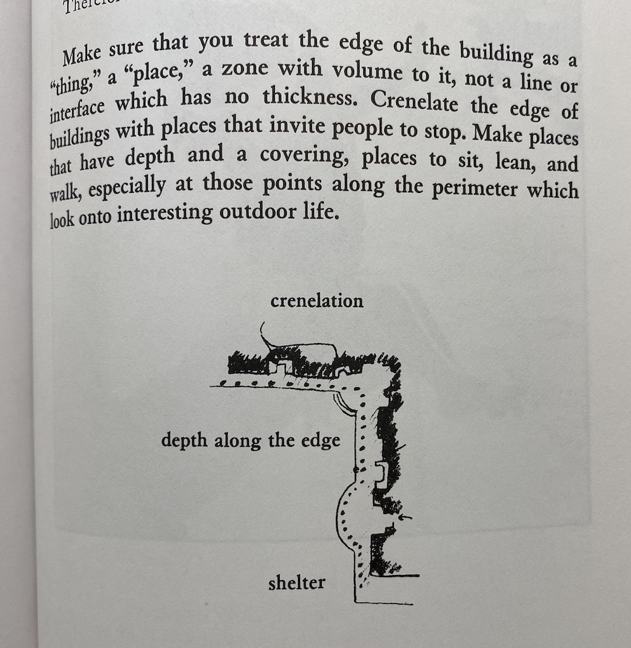
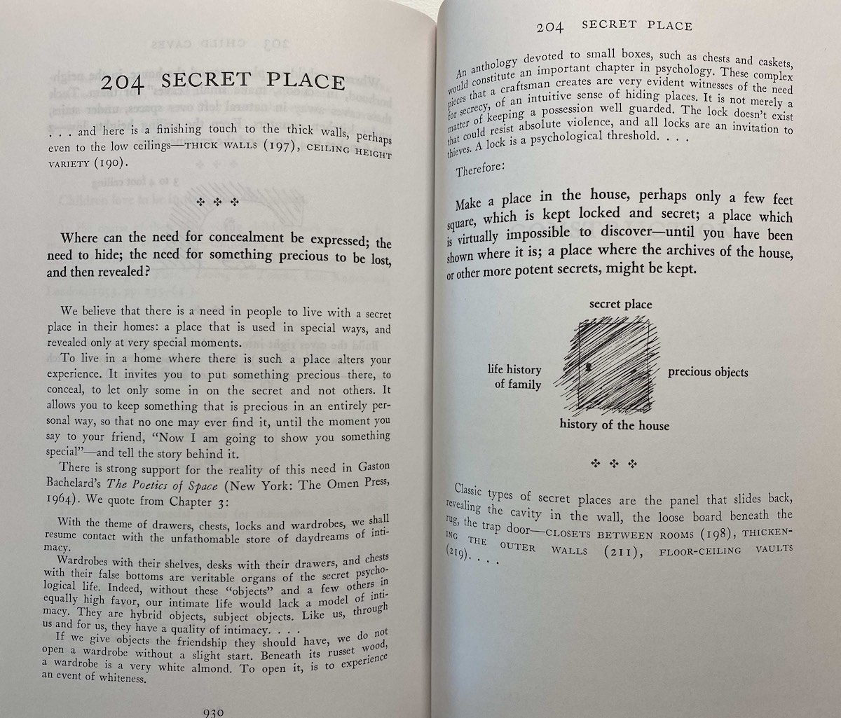
I’m so curious to see which of these patterns might apply in the digital. Some seem very promising. For example, the “building edge”, which can either support or reject life.

What is that in multiplayer spaces? Is it the “lobby” of the game where you hang out with your friends? Is it the little hidden nooks and crannies where you can have fun before jumping into the fray? What does this mean for something like a collaboration tool?
Other spaces are less obvious, or might seem less “necessary” in the prioritized world of product roadmapping, but that’s perhaps what makes them essential. I experienced this pattern as a child as the mysterious basement in my grandparent’s home in Normandy. At the end of a dusty hallway, behind a locked, half-height door, was a room with my uncle’s old train set and vinyl records, which me and my brother were very sensibly kept out of. Perhaps you need such things to make a digital space feel “deep” with mysteries for the masters to pass on to the next generation. Not everything needs to be revealed on day one.
Slow down
Community doesn’t happen when people simply pass through a space. They need reasons to slow down and feel their presence sink into it. A cursor moving at warp speed is just looking for its next hit of functionality. But slow it down, let it become a little more corporeal, and perhaps it will encounter the other avatar cursors in a different and more wholesome way.
As everyone from the Center for Humane technology to Robert Mueller have accurately described, Facebook and Twitter haven’t succeeded in changing culture because they directly nail you with a particularly targeted ad. It’s not a software ⇄ human relationship. These social networks managed to skew culture because they change the rules of interaction between people (in a way that could be weaponized by those dedicated and lacking-scruple enough to use as a scalpel to pry apart communities). It’s software as an intermediary. Human ⇄ Software ⇄ Human.
Software as a space, not empty, but endowed with norms and mechanics.
But perhaps as professional tool, one which encourages a deeper level of creation and presence, can slow things down even further, becoming a real place where creative community hangs out on the stoop.
And blame? Fork that.
Notes
- If you haven’t encountered Christopher Alexander before, a great and loving starting point is Jesse Schell’s GDC 2018 talk, “The Nature of Order in Game Narrative”. All the images discussed come from “A Pattern Language”
- Normally I’d integrate games into the piece, but it was getting long enough. But nevertheless, check out Shelter for its beautiful pseudo abstract depiction of a journey through the wild as a mother badger sheltering her cubs from harm. For a darker exploration of feeling exposed, there is Inside, a strange boy’s journey through a hostile, Orwellian environment with a heck of an ending.
- In the tabletop space, go check out The Warren, a tabletop role-playing game about intelligent rabbits trying to make the best of a world filled with hazards, predators and, worst of all, other rabbits. Consider some of these key moves (verbs) and how they support the feeling of exposure: “Resist Panic”, “Pay Attention”, “Bolt”, “Sneak”, “Dig”
- This made me chuckle—a handy flowchart to see if you are an **shole designer. From Paul Woods’ book “How to Do Great Work Without Being an Asshole”
You've reached the end, my friend. Sign up to get the next one right in your inbox